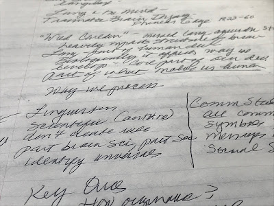
Margins as Message
In a retrospective mood after yesterday’s blog anniversary, I pulled out an old hard-bound journal and started reading.
It was summer. The previous fall, I’d accepted an editorial position downtown, my first office job in 17 years, though I hadn’t yet extricated myself from writing freelance articles. I had three- to four-hour roundtrip commutes and deadlines when I got home. My daughters were 10, 13 and 16. Every few minutes, I was driving them to band camp or track practice or the movies.
Still, my first thought on reading the loopy entries from those crazy days was … why didn’t I leave wider margins? Every available inch was pressed into service. I had trouble reading my own writing.
It took me a minute to realize the connection, the appropriateness of the typography. The pages were as busy as I was. The margins were the message.
(Above, some halfway-margined class notes from last week.)
